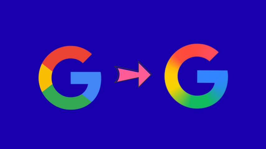
Google to make its G more shiny

Google is giving its most recognisable symbol a new look, updating the four-colour "G" that has represented the company for the past decade.
According to a recent blog by Google, the new design, which introduces brighter hues and a gradient effect, will now serve as the company-wide icon across all products, platforms and services. Google first rolled out the refreshed version in June, 2025 as part of Gemini Spark, before deciding to extend it more broadly.
The company said the change is intended to reflect its evolution in the era of artificial intelligence (AI), while retaining the familiar four-colour scheme. The brighter tones are meant to signal creative energy and the momentum of AI-driven innovation across its technology.
The redesign will appear across more products and platforms in the coming months, as per Google.


 For all latest news, follow The Daily Star's Google News channel.
Comments